
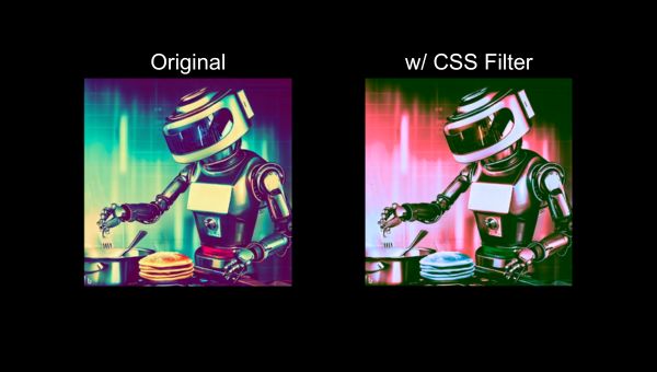
What is the CSS filter property?
The CSS filter property lets you apply a collection of visual effects to your elements. For example, you can raise and lower the brightness of an image, apply a sepia effect, and even combine multiple filters for a unique visual flavor. The CSS filter property can be used in lieu of importing an image into an image editor (ie Photoshop, GIMP), making changes to it, exporting it, then finally uploading it for use on your site. This can be very helpful when you're constantly changing your web design, or if you're not sure if the changes you're making will remain the same over the long term- simply adjust the CSS on the same image asset as needed.
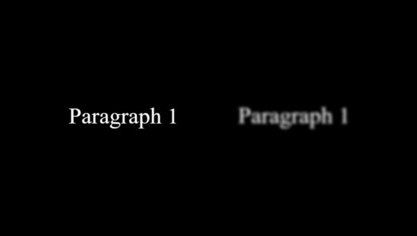
Although most commonly used on images, the CSS filter property can apply its effects to other elements as well. For example, you can apply a blur effect to a paragraph element to partially obscure the text.
CSS Filter Examples
Each of the CSS filters make use of a function and parameter. The function's name corresponds to the graphical effect you're trying to apply (ie blur), and the parameter is a value that you can set and adjust to fine-tune how your graphical effect looks.
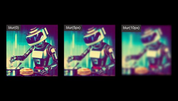
Blur | CSS Filter
The blur function applies a gaussian blur effect to your element. The amount of blur depends on what you have your parameter set to.
The parameter's value refers to the radius of the blur, it is a CSS length (ie px, rem), but it does not accept percentages. This radius value is the standard deviation value to the Gaussian function, which translates to how many pixels on the screen will blend into each other. Therefore a higher radius value will make the element blurrier.
Brightness | CSS Filter
The brightness function lets you increase and decrease the brightness of an element by setting its parameter to a desired value (ie 50%). The parameter is a linear multiplier, meaning that you can use percentage values and numeric values (integers, and decimals are acceptable). Values over 100% will brighten the element beyond it's default value.
Brightness Value Examples
- brightness(100%) will leave the brightness unchanged
- brightness(50%) lowers the brightness to half of its original value
- This is the same as brightness(0.5) - brightness(150%) raises the brightness by 50%
- This is the same as brightness(1.5)

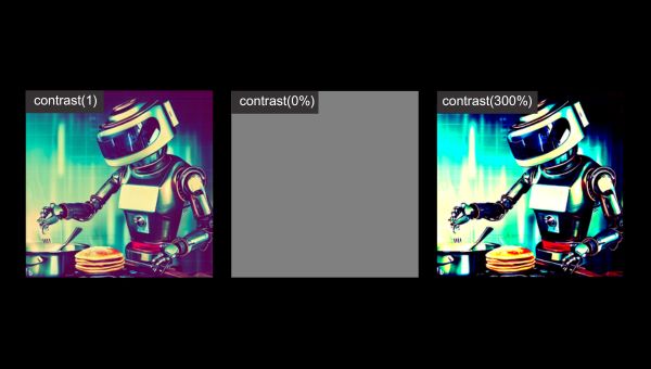
Contrast | CSS Filter
The contrast function allows you to adjust the contrast of an element in largely the same way as the brightness function. The function's parameter can be set to a percentage or a number (integer, or decimal).
Contrast Value Examples
- contrast(0%) washes out the image to a singular grey color
- contrast(100%) has no effect
- This is the same as contrast(1) - contrast(300%) will increase the contrast by 200%
- This is the same as contrast(3)
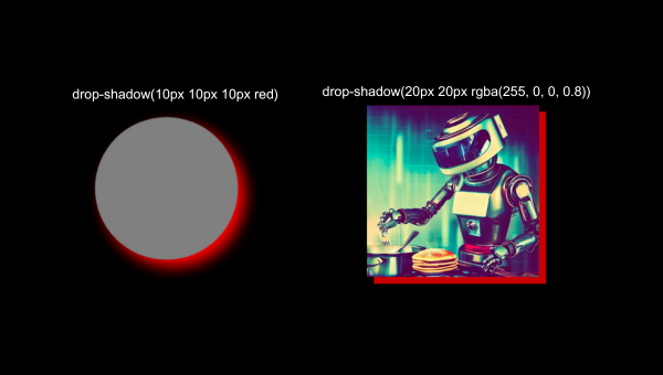
Drop-Shadow | CSS Filter
The drop-shadow function adds a shadow behind the selected element. The shadow follows the shape of the element (its intended outline). Drop-shadow's syntax is similar to the syntax used with the box-shadow CSS property, however, the inset and spread parameters are not supported.
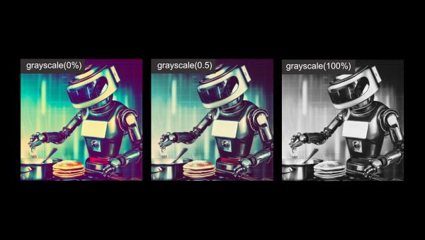
Grayscale | CSS Filter
The grayscale function converts an element to grayscale. The function's parameter serves as a linear multiplier on that grayscale effect. Therefore, when a value of 100% is used, the element is entirely grayscale and a value of 0% removes the grayscale effect. Alternatively, you can use decimal form instead of percentages.
Grayscale Value Examples
- grayscale(100%) applies the entire grayscale effect
- This is same as grayscale(1) - grayscale(0.5) applies half the grayscale effect
- This is the same as grayscale(50%) - grayscale(0%) applies no grayscale effect
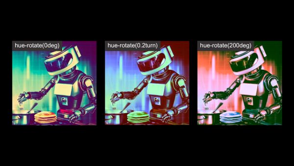
Hue-Rotate | CSS Filter
The hue-rotate function applies a hue rotation based on a the value of its parameter. The value represents how many degrees around the hue color circle the selected element's colors will be adjusted by. The parameter has a minimum value of 0deg (no color change) and a maximum value of 360deg. As an alternative to degrees, you can set the parameter's value via the turn unit.
Hue-Rotate Value Examples
- hue-rotate(0deg) has no color change
- hue-rotate(360deg) also has no color change - hue-rotate(90deg) is the same as hue-rotate(0.25turn)
- hue-rotate(180deg) is the same as hue-rotate(0.5turn)
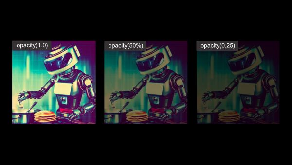
Opacity | CSS Filter
The opacity function adjusts how transparent your selected element is, based on what the function's parameter is set to. The parameter's value can be set to a percent, or an equivalent decimal form value between 0% and 100%. A value of 0% will make the element completely transparent, where a value of 100% represents no opacity change.
Opacity Value Examples
- opacity(50%) is the same as opacity(0.5)
- opacity(100%) makes no change
- This is the same as opacity(1.0) - opacity(0%) makes the selected element completely transparent
- This is the same as opacity(0)
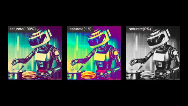
Saturate | CSS Filter
The saturate function saturates the selected element through the adjustment of it's parameter. The parameter's value is a linear multiplier on the saturate effect, therefore you can set it to a percentage, or number (integer or decimal). A value of 100% leaves the element unchanged, while a value of 0% makes the element completely unsaturated. You can set the value to a higher value than 100%.
Saturate Value Examples
- saturate(300%) is the same as saturate(3)
- saturate (100%) makes no change
- This is the same as saturate(1) - saturate(0%) takes all the saturation away
- This is the same as saturate(0)
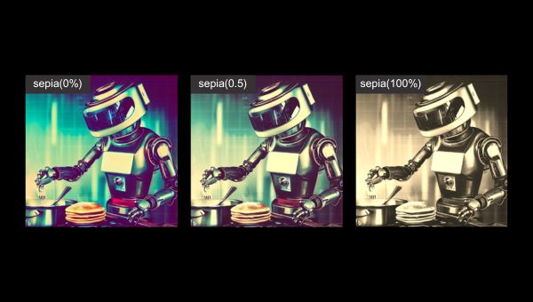
Sepia | CSS Filter
The sepia function converts an element to sepia based on the value of its parameter. The value can be in percentage, or decimal form - starting at 0% and maxing out at 100%. A value of 100% makes the element completely sepia, while 0% leaves the element unchanged.
Sepia Value Examples
- sepia(50%) applies half of the sepia effect
- This is the same as sepia(0.5) - sepia(0%) does not apply any sepia effect
- sepia(100%) applies the full sepia effect
URL | CSS Filter
The url function takes in the location of an XML file that contains at least one SVG filter element. The parameter can contain an anchor to reference a specific SVG filter within the specified XML file.
CSS-Tricks has an extensive tutorial to get you started with CSS Filters + SVG filter elements that you can check out here.
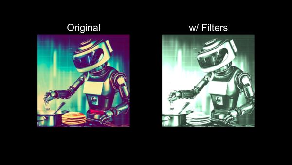
Combining Multiple CSS Filters
Sometimes a single CSS filter isn't enough to achieve the visual effect you need. Luckily, you're able to combine multiple filters together by putting them space-separated in your filter property.
Ordering Multile CSS Filters
Sometimes placing filters in the "wrong" order can result in unwanted visual effects. For example, if you use the grayscale function after the sepia function, the sepia coloring may be largely "washed out" by the grayscale effect. We recommend experimenting with ordering your filters differently to sometimes achieve different effects.
Multiple CSS Filters Example
CSS
Output
Video Tutorial
We've put together a short vertical video tutorial to help you learn how to use CSS filters in your web development projects.
This tutorial is also available on our LinkedIn, Instagram, and Facebook.
